Font
 Having one of the requests in my audience feedback been to change the font, I have chosen to experiment with some differing fonts on the title shot in the sequence.
 To the right are the three different fonts that I had tested in the redrafting process. However, while I found the fonts palatable individually, I don't think they particularly suit the the opening sequence. The first font is too simple to a point that, when paired with the unsaturated colouring of the setting, it comes across as somewhat boring and stimulating visually.
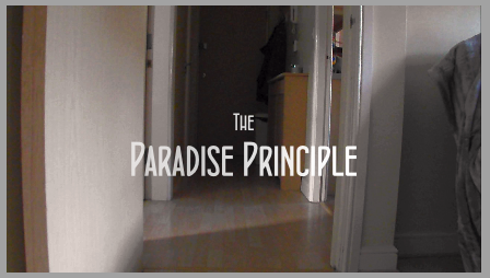 The second font, while being slightly more interesting than the previous, is simply too big for the screen. Even though I would be able to scale all of the captions in the sequence down I would not be able to do it consistently, this will make the sequence inconsistent.
The third font is more eccentric than the other two however, this gives off the vibe that the sequence will appear to be more unprofessional. Also with this font the minimalist tone that I had aimed for with the captions will be lost.
As a result of this I have chosen to keep the captions in their original font. This would not be much of a problem for the majority of the target audience as personal taste varies frequently.
Company Logos
Another request for improvement was the presentation of the logos of the distribution company and production company. Initially these were less refined and looked somewhat grainy and unprofessional.
To correct this I had used a picture editing software to cut around the sections of each logo that appeared pixelated. I then put a slight blur around the outline of the cut so the edges will look rounded as opposed to how it previously looked.
 |
| How the logo will look in the sequence. |
| During the cutting process. |
Elongating the Shot
 The final request to improve my sequence was to lengthen a particular shot that some participants for difficulty fully reading in time. This was rather simple to improve.
To do this I simply pushed the clips after it further along the timeline and then dragged the end of the specific clip to meet the next one.
No comments:
Post a Comment